Quick overview:
Updated LinkedIn post image sizes for 2024
Optimal dimensions for personal profiles and company pages
Best practices for creating eye-catching visuals
Tips for mobile-friendly LinkedIn posts
How to leverage different post formats effectively
Strategies for measuring post performance
Tools to simplify LinkedIn content creation
Are you struggling to make your LinkedIn posts stand out in a crowded feed?
You're not alone.
Many professionals find it challenging to create visually appealing content that captures attention and drives engagement.
But here's the good news: by understanding the right LinkedIn post size 2024 guidelines, you can significantly boost your content's impact.
Let's dive into the essential dimensions and best practices that will help your posts shine.
LinkedIn Post Image Size 2024: What's Changed?
Did you know that visual content gets 94% more views than text-only posts on LinkedIn?
That's why nailing your image sizes is crucial.
For 2024, LinkedIn has made some subtle but important changes to its recommended image dimensions.
Here's what you need to know:
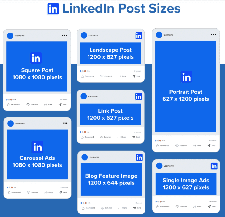
Single image posts: 1080 x 1080 pixels (square) or 1920 x 1080 pixels (landscape)
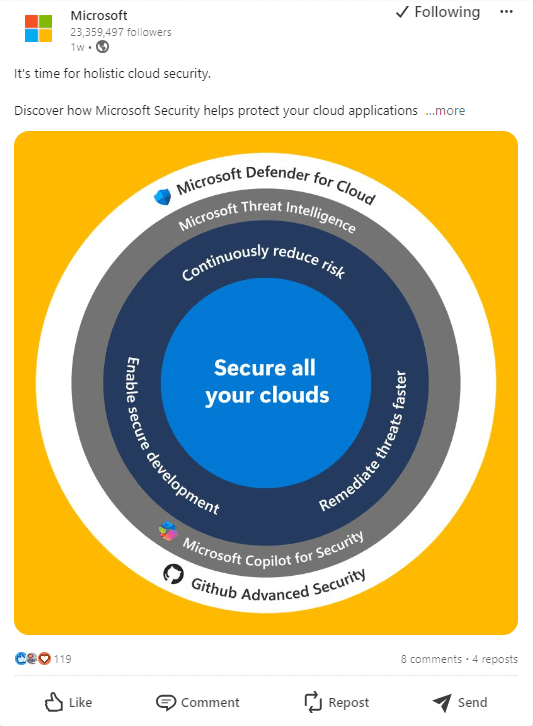
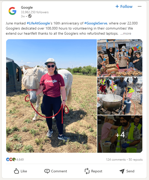
Multi-image posts: 1080 x 1080 pixels (square) for best results
Article featured images: 1200 x 644 pixels
Blog post link images: 1200 x 627 pixels
Pro tip: Always use high-resolution images to ensure clarity across devices.
Why is getting the right LinkedIn post size so critical?
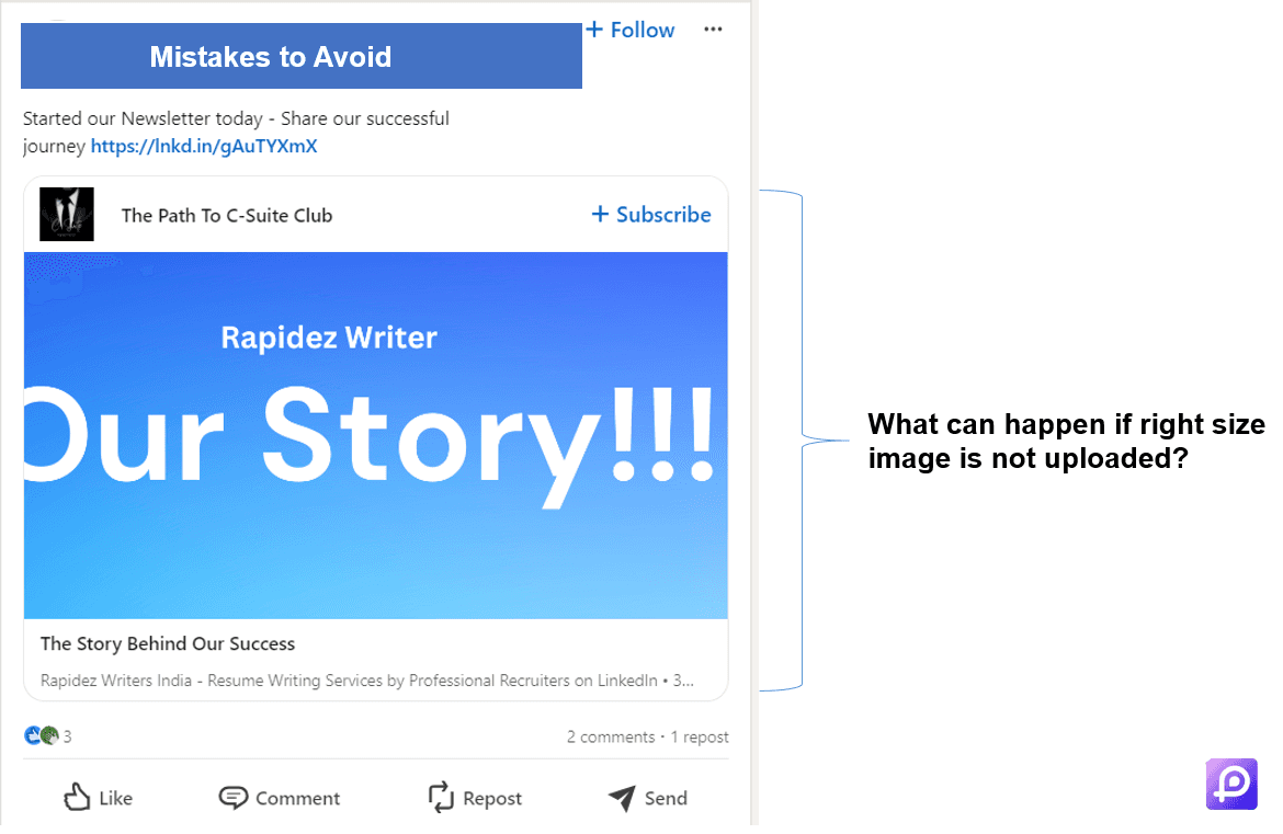
Imagine this: You've created an amazing infographic or product shot, only to have it appear cropped or distorted in your LinkedIn post. Parts of your image are cut off, text is unreadable, or worse - your main message is lost entirely.
Using the wrong image size can make your posts look unprofessional and incomplete. It's like showing up to a business meeting with half your presentation missing.
Correct sizing ensures:
Your entire image is visible
Text and important details are clear and readable
Your post looks professional across all devices
Higher engagement rates as users can fully appreciate your content
Remember, first impressions matter on LinkedIn. A properly sized image shows attention to detail and respect for your audience's viewing experience.
Don't let incorrect sizing undermine your hard work. Stick to these 2024 guidelines to make sure your visual content always puts its best foot forward.
LinkedIn Post Photo Size 2024 for 10X Impact
Did you know that visual content gets 94% more views than text-only posts on LinkedIn?
That's why nailing your image sizes is crucial.
For 2024, LinkedIn has made some subtle but important changes to its recommended image dimensions.
Here's what you need to know:
Single image posts: 1080 x 1080 pixels (square) or 1920 x 1080 pixels (landscape)
Multi-image posts: 1080 x 1080 pixels (square) for best results
Article featured images: 1200 x 644 pixels
Blog post link images: 1200 x 627 pixels
Pro tip: Always use high-resolution images to ensure clarity across devices.
But why are these specific dimensions so important?
LinkedIn's algorithm favors posts that fit perfectly within the platform's layout. When your images are the right size, they're more likely to be displayed prominently in users' feeds.
This increased visibility can lead to higher engagement rates, more comments, and a wider reach for your content.
LinkedIn Post Photo Size 2024: All You Need to Know
How can you make your photos pop on LinkedIn in 2024?
It's all about understanding the platform's preferences.
LinkedIn favors images that are crisp, professional, and relevant to your content.
Here are some key photo sizes to remember:
Profile picture: 400 x 400 pixels
Background photo: 1584 x 396 pixels
Company logo: 300 x 300 pixels
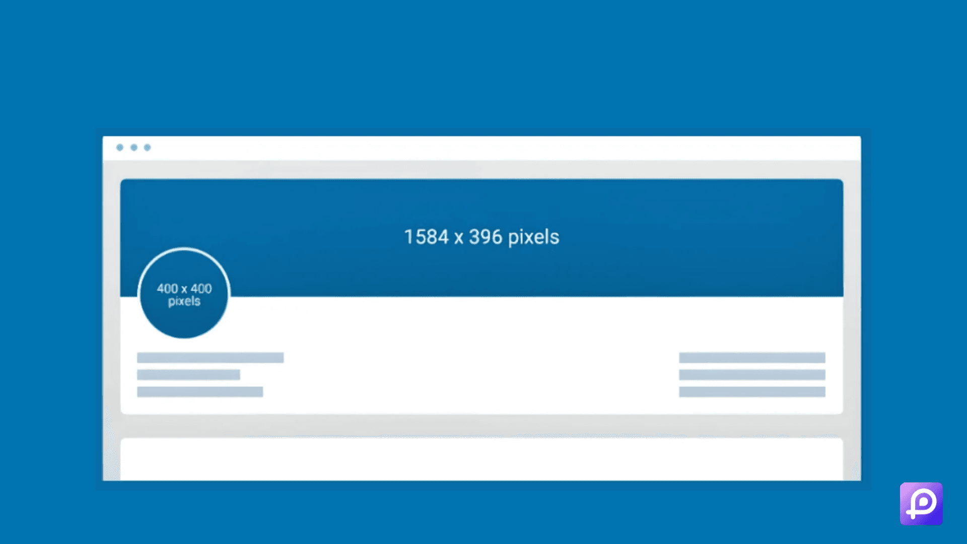
Remember, these dimensions ensure your photos look great on both desktop and mobile devices.
But size isn't everything. What else should you consider when selecting photos for LinkedIn?
Relevance: Choose images that relate directly to your post content.
Quality: Use high-resolution photos to maintain clarity.
Branding: Incorporate your brand colors or logo when appropriate.
Authenticity: Real photos of you or your team often perform better than stock images.
Did you know that posts with images get 2x higher engagement than those without?
This statistic underscores the importance of including visuals in your LinkedIn strategy.
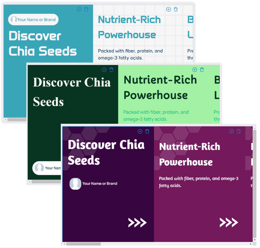
The Power of LinkedIn Carousel Posts: Simplified with Dottypost
Have you tried carousel posts yet?
They're a fantastic way to tell a story or showcase multiple products or ideas. And now, creating them is easier than ever.
For 2024, LinkedIn recommends:
Carousel image size: 1080 x 1080 pixels
File format: PDF (for best results)
Carousel posts typically see 3-5 times more engagement than single-image posts.
But here's the game-changer: Dottypost's Carousel Generator.
Ever wished you could transform any content into an engaging carousel? Now you can.
Here's how Dottypost simplifies the process:
Copy and paste a link: It could be a YouTube video, blog post, or article.
Let the tool work its magic: Dottypost automatically converts the content into visually appealing carousels.
Choose your style: Select from various carousel designs that suit your brand.
Share and watch engagement soar: Your professional-looking carousel is ready in minutes.
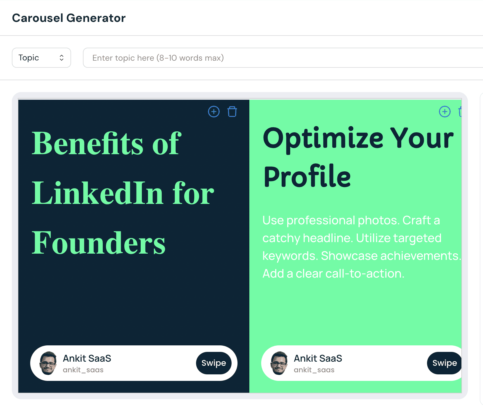
The best part? You don't need design skills. Dottypost does the heavy lifting, ensuring your carousels are optimized for LinkedIn's 2024 size recommendations.
Why struggle with complex design software when you can create stunning carousels with just a few clicks?
Are you ready to revolutionize your LinkedIn content strategy with eye-catching carousels?
Video Content: The Rising Star of LinkedIn
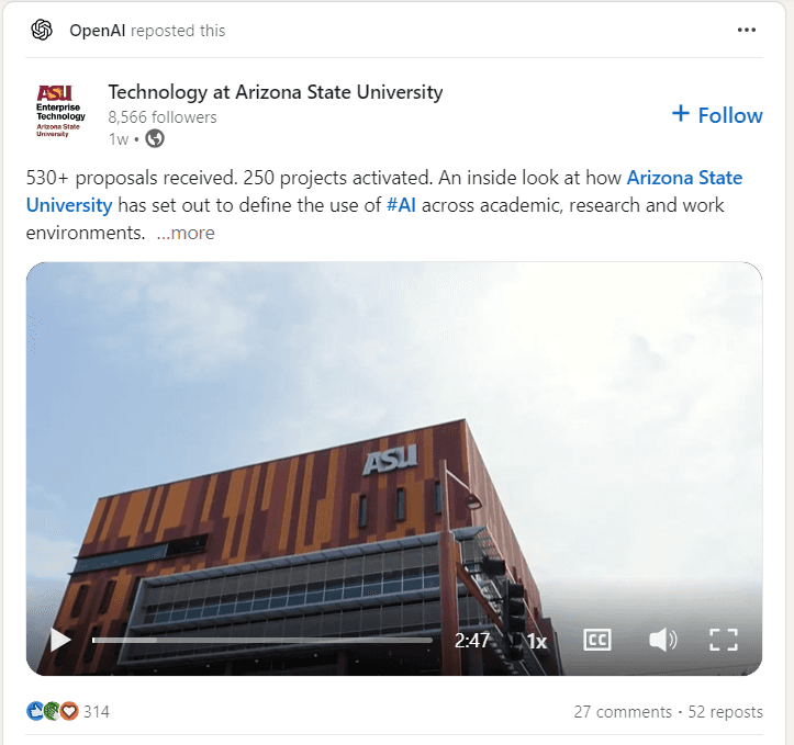
Did you know that videos on LinkedIn get shared 20 times more than any other type of content?
To make the most of video posts in 2024, follow these guidelines:
Minimum size: 256 x 144 pixels
Maximum size: 4096 x 2304 pixels
File size: 75KB to 200MB
Maximum length: 10 minutes
Pro tip: Always include captions in your videos. 85% of video views on LinkedIn happen with the sound off!
But what types of videos perform best on LinkedIn? Here are some ideas:
How-to tutorials related to your industry
Behind-the-scenes glimpses of your work process
Quick tips or industry insights
Customer testimonials or case studies
Product demonstrations
Remember, the key is to provide value to your audience. What information can you share that will help them in their professional lives?
LinkedIn Stories: A New Frontier for Engagement
LinkedIn Stories for Pages offers a unique way to share quick, ephemeral content.
For optimal visibility in 2024:
Image size: 1080 x 1920 pixels
Aspect ratio: 9:16
Stories are perfect for behind-the-scenes glimpses or quick tips related to your industry.
But how can you make the most of this format? Here are some strategies:
Use stickers and text overlays to make your stories more interactive.
Share polls to engage your audience and gather insights.
Highlight company culture or team members to humanize your brand.
Offer exclusive content or announcements to encourage followers to check your stories regularly.
Remember, stories disappear after 24 hours, so use them for timely, in-the-moment content.
Mobile Optimization: A Must for 2024
Did you know that over 57% of LinkedIn users access the platform via mobile devices?
To ensure your posts look great on smaller screens:
Use large, readable fonts
Keep designs simple and uncluttered
Test your posts on mobile before publishing
Use high-contrast color schemes for better visibility
By optimizing for mobile, you're catering to the majority of LinkedIn users.
But mobile optimization goes beyond just image sizes. Here are some additional tips:
Write concise, scannable copy
Use bullet points or numbered lists for easy reading
Front-load important information in your posts
Ensure any links you include are mobile-friendly
Remember, a poor mobile experience can significantly decrease engagement with your content.
Measuring Success: Beyond Just Sizes
While getting the right LinkedIn post size in 2024 is crucial, it's not the only factor in creating successful content.
Track these metrics to gauge your post's performance:
Impressions: How many times your post was seen
Engagement rate: The percentage of viewers who interacted with your post
Click-through rate: How many people clicked on links in your post
Comments and shares: Indicate how compelling your content is
Follower growth: Track if your posts are attracting new followers
Remember, the goal is to create content that resonates with your audience, not just to hit size targets.
But how can you use these metrics to improve your strategy? Here are some ideas:
Compare performance across different post types (images, videos, carousels)
Analyze which topics generate the most engagement
Identify the best times to post based on when your content gets the most views
Use comments to gather insights about what your audience wants to see more of
Don't be afraid to experiment with different formats and content types. What works for one audience might not work for another.
Leveraging LinkedIn's Algorithm in 2024
Understanding LinkedIn's algorithm can help you maximize the impact of your perfectly-sized posts. Here's what you need to know:
Relevance: LinkedIn prioritizes content that's relevant to each user's interests and network.
Engagement: Posts that generate quick engagement are more likely to be shown to a wider audience.
Connections: Content from users' direct connections is given priority.
Dwell time: The amount of time users spend looking at your post affects its reach.
How can you use this information to your advantage?
Create content that encourages meaningful conversations
Post when your audience is most likely to be active
Engage with others' content to increase your visibility
Use hashtags strategically to reach interested users outside your network
Remember, high-quality, relevant content is key. Even the perfect post size won't help if your content doesn't provide value to your audience.
Putting It All Together: Your 2024 LinkedIn Strategy
Are you ready to elevate your LinkedIn presence with these size guidelines and strategies?
Start by auditing your existing content.
Which posts performed well?
Do they align with these new size recommendations?
Use this information to refine your strategy for 2024.
Here's a step-by-step plan to get you started:
Update your profile and company page images to the new recommended sizes.
Create a content calendar that includes a mix of post types (single images, carousels, videos, stories).
Use tools like Dottypost to simplify carousel creation.
Implement a regular posting schedule, aiming for consistency rather than frequency.
Monitor your post performance and adjust your strategy based on what resonates with your audience.
Engage with your network regularly to boost your visibility on the platform.
Stay updated on LinkedIn's evolving best practices and algorithm changes.
Remember, consistency is key.
Stick to these guidelines, but don't be afraid to experiment and find what works best for your unique audience.
What LinkedIn post size secret will you implement first in your 2024 strategy?
By focusing on optimal sizes, varied content types, and audience engagement, you can transform your LinkedIn presence from forgettable to fantastic.
Are you ready to stand out in the LinkedIn feed? Start implementing these strategies today and watch your professional network grow!
Enjoy reading post?
Follow me on :

